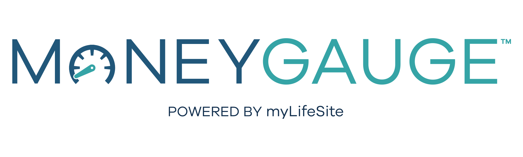
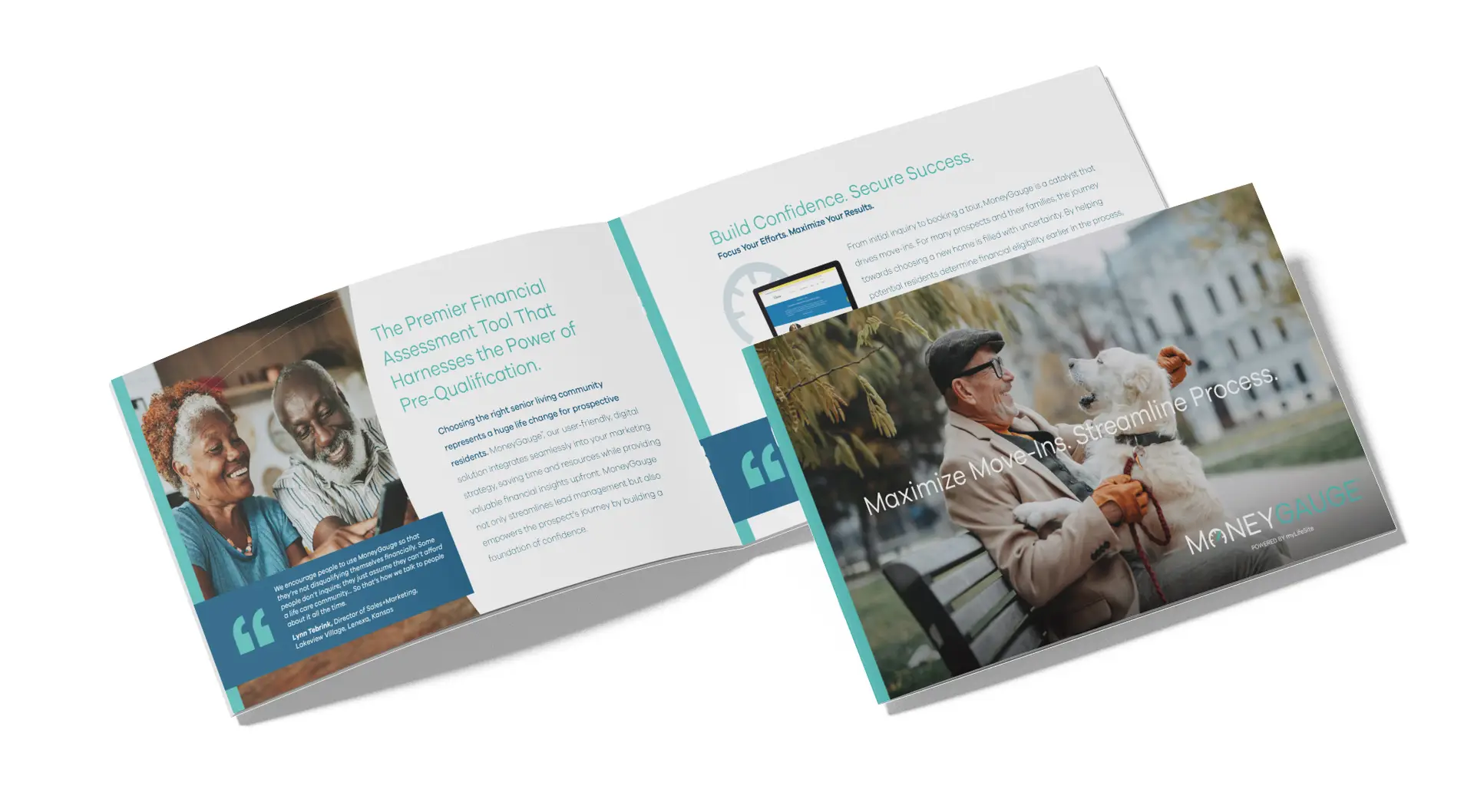
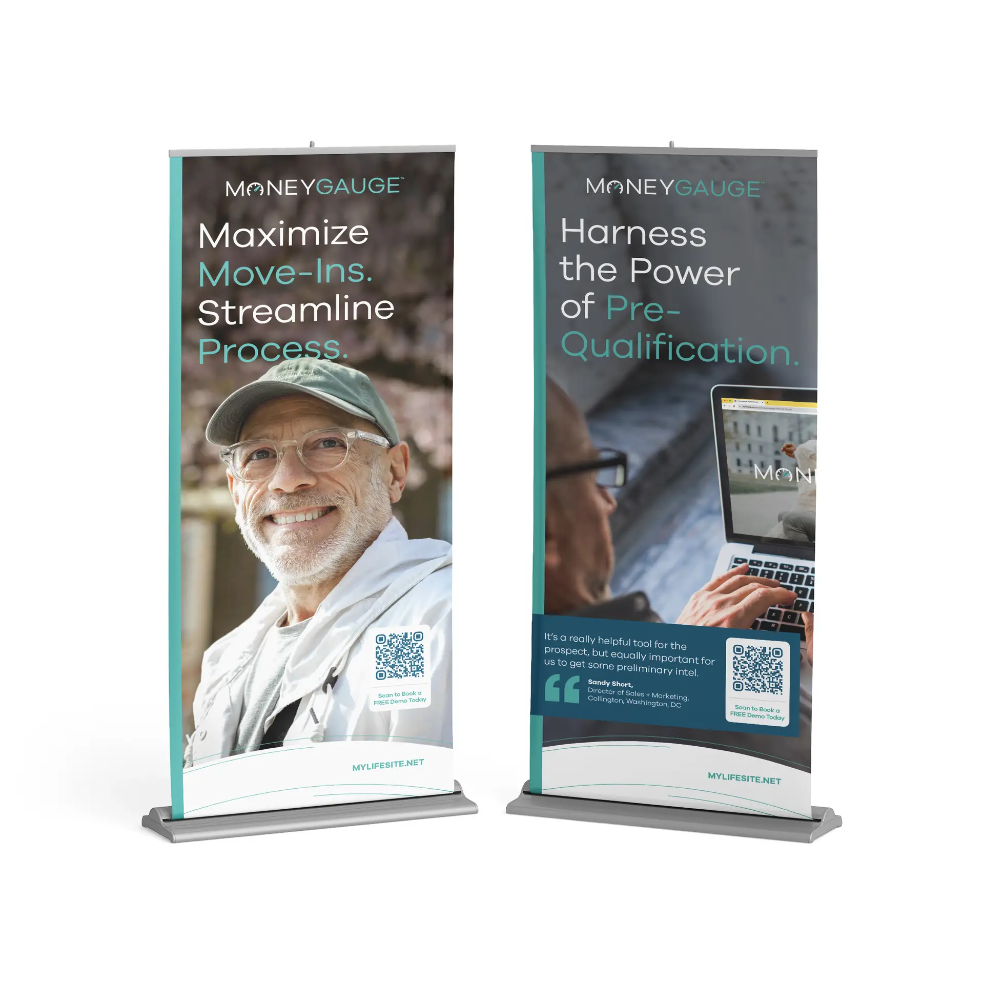
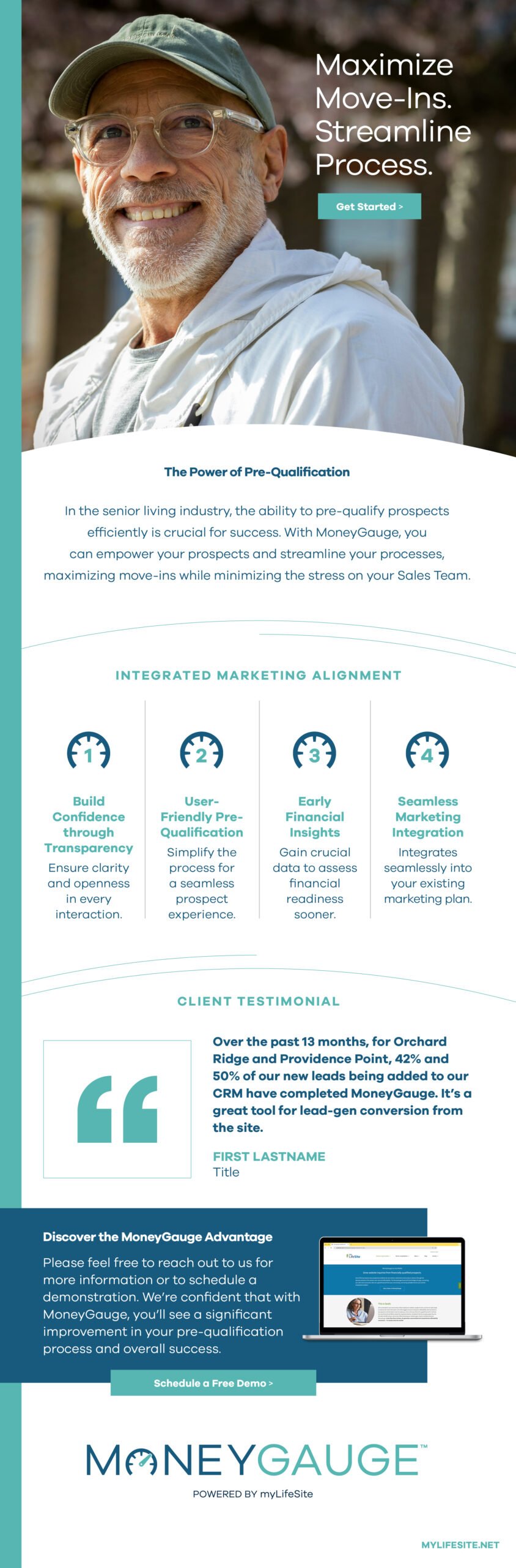
This creative positions MoneyGauge as an essential tool for senior living communities, streamlining the journey from initial interest to move-in to boost move-in rates and enhance efficiency. The blue and teal color palette conveys trust and clarity, while the modern typeface ties into the gauge-inspired logo, and vibrant portraits highlight the empowerment and optimism MoneyGauge brings to both residents and communities.
Final wordmark
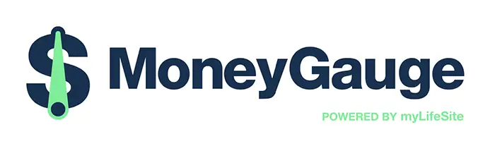
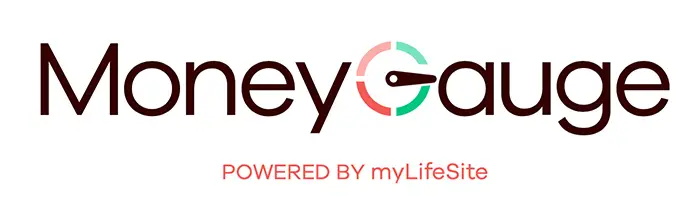
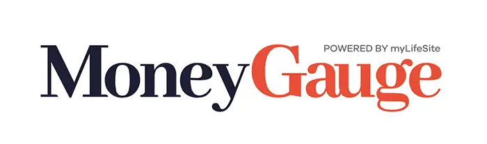
Wordmark concepts
Sales brochure
Eblast
conceptual development
Take a sneak peek at the innovative and captivating creative concepts that were presented for this project.
Each concept is custom-tailored to suit the unique needs and preferences of the client, ensuring a truly personalized approach to every project. Explore the creativity behind these concepts, designed to inspire and engage audiences in meaningful ways.
This content is password protected. To view this content, contact info@PatrickHornungCreative to request permission.
Once viewing, click the Toggle Fullscreen button to view the PDF larger