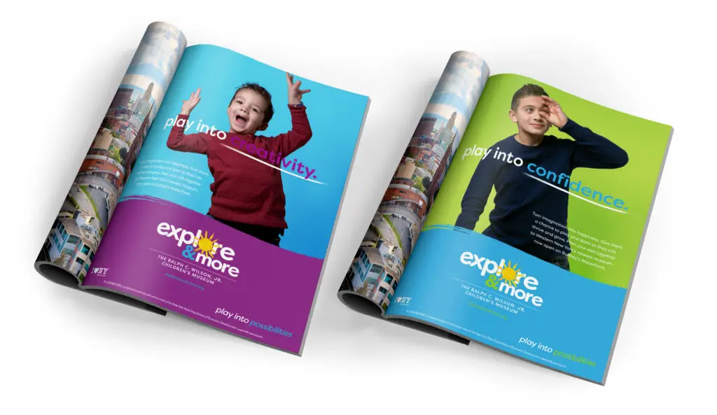
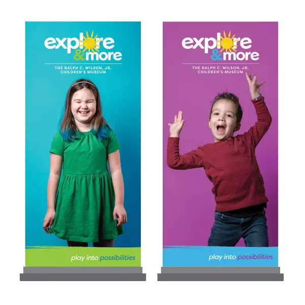
Explore and More’s rebranding emphasized vibrant and playful elements, from the logo to the color palette and typography, all aimed to ignite curiosity and excitement in children and families. This creative approach culminated in the Play into Possibilities campaign, celebrating imagination and inviting everyone to embark on a journey of limitless exploration and joy.
brand style guide
A brand style guide is an essential resource for maintaining consistency in visual identity. It details key elements such as the logo, color palette, typography, and usage guidelines. Adhering to these standards strengthens brand recognition and creates a cohesive experience.